


Featured Items
Featured Items highlights select work that represents both strategic thinking and hands-on execution. Each piece was created to solve a real business problem — whether that meant increasing visibility, clarifying a message, or elevating a brand’s presence across print, digital, and social channels. These aren’t speculative designs or one-off experiments; they’re practical, performance-driven solutions shaped by real deadlines, real stakeholders, and real results.

Licensed Associate Real Estate Broker
Douglas Elliman Real Estate
Irene Siconolfi is a top-producing Associate Broker at Douglas Elliman with over 25 years of real estate experience and more than $125 million in closed sales. Licensed in both New York and Florida, Irene brings a rare combination of deep market knowledge, strategic negotiation skills, and a highly personal approach to every transaction. Her career is defined by integrity, consistency, and results—earning her numerous industry awards and long-standing client trust across Long Island and beyond.
This multi-page, high-end brochure presents Irene Siconolfi as both a trusted advisor and a proven market leader. Designed with a refined, lifestyle-driven aesthetic, the spreads combine elegant photography, thoughtful typography, and structured content to clearly communicate her value proposition.
The brochure highlights Irene’s background, dual-state licensure, sales accomplishments, and comprehensive marketing strategy—covering professional photography and video, custom property websites, digital advertising, social media, email campaigns, and targeted events. Client testimonials and recent listings reinforce credibility, while the overall design balances warmth, authority, and polish, making it equally effective as a listing presentation tool or brand statement piece.
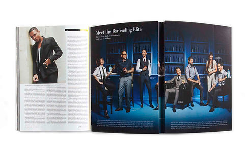
GQ Magazine
This project involved prepress print production for a multi-page magazine feature developed by BBDO for Bacardi, celebrating the Most Imaginative Bartender competition. While I was not the original designer, I was responsible for preparing the complex layout for press — ensuring that multi-page spreads, gatefolds, and folds aligned precisely once printed and bound. This required careful management of trim, bleed, creep, and fold mechanics so imagery, typography, and visual rhythm landed correctly across panels. Color accuracy and consistency were also critical, particularly given the rich, saturated palette and brand-sensitive photography. The final execution required close attention to production standards to ensure the creative intent translated cleanly from layout to finished magazine.

Over the course of more than 13 years, I handled prepress production across an exceptionally wide range of large-scale and high-visibility media while working at BBDO and eg+ Worldwide. This included outdoor and transit signage, digital and static OOH, magazine advertising, and large-circulation newspaper placements for major national and global brands such as Pepsi, Starbucks, Schering-Plough, AIG, Armstrong, Guinness, M&M’s, Mountain Dew, Bank of America, AT&T, FedEx, ExxonMobil, and others. In addition to file preparation, I was responsible for running and managing contract-quality proofs so project managers and stakeholders could accurately review color prior to press, giving me hands-on experience with professional proofing systems and color-critical workflows. The work routinely involved complex specifications, unconventional formats, and extreme scale — from building wraps and citywide marathon signage to stadium-adjacent and transit-based executions.
In one instance, I identified a 10-foot discrepancy in a Chicago building schematic prior to production, preventing a costly and highly visible error on a Bank of America installation tied to the Chicago Marathon. Across all projects, my role was to ensure accuracy, alignment, color fidelity, and structural feasibility — protecting both the creative intent and the brand at the point where mistakes become permanent.
I served as the key prepress production artist for a series of Bank of America print campaigns developed at BBDO in partnership with Major League Baseball. The campaign typography was created as physical letterforms — each character produced as an individual piece of artwork, photographed, digitized, and delivered to production as a full alphabet set. My role was to engineer those letterforms into finished layouts, constructing precise typographic arcs that mimicked the curvature of baseball jersey lettering and manually placing each letter image to maintain spacing, alignment, and visual rhythm at scale. Because the work carried dual brand and league requirements, the ads also included extensive legal and regulatory copy, requiring close coordination with proofreading and production teams to ensure accuracy before release. The final executions demanded exacting control over layout, scale, and reproduction — translating handcrafted creative intent into press-ready files that could withstand high-circulation publication without compromise.


This project involved prepress production for a specialty candy wrapper, where precision around folds, seams, and readability was critical to the final result. My role focused on preparing the artwork so typography, brand marks, and regulatory copy aligned cleanly once wrapped — accounting for trim, glue areas, overlap, and distortion caused by the wrapping process itself. Special attention was paid to color consistency and ink coverage to ensure the vibrant palette reproduced accurately on press without bleeding, banding, or loss of detail. The final execution required a disciplined, production-first approach so the design held its integrity not just flat, but fully wrapped and handled.